Design for MetLife.com Registration
Overview:
This project focuses on improving the online registration experience for MetLife.com. It helps new users sign up, access the site, and manage or update their product information.
Pain Points
The original registration process was confusing and lengthy—spread over 8 steps. The language used was not user-friendly, errors were common, and the password requirements were overly complex. These factors discouraged users from completing registration.
The Task
Our goal was to simplify and redesign the information architecture, layout, and user flow. We needed to make the experience more intuitive and efficient, then translate that into high-fidelity mockups using MetLife’s design system.
Process
Research & Discovery
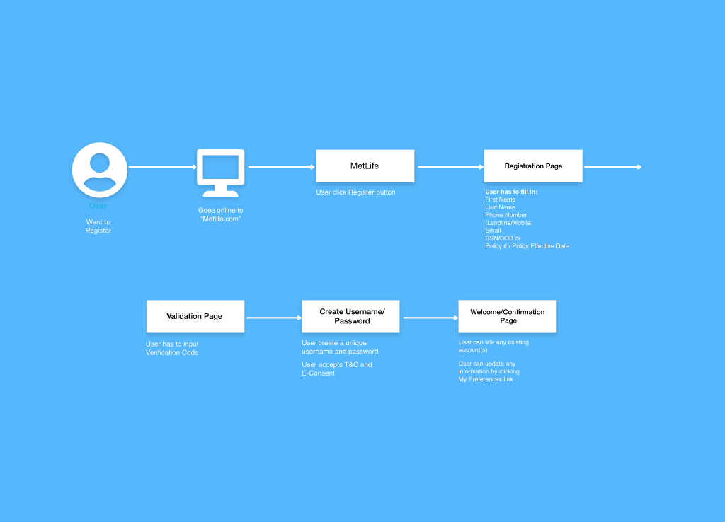
We interviewed internal stakeholders and business partners to understand the necessary information. We also reviewed competitor sites and analyzed user behavior in the existing flow.User Journey Map
We mapped the current journey to identify gaps and areas for improvement. The original 8-step process typically took 8–10 minutes and caused a high drop-off rate. We reduced this to 3 steps, with completion under 3 minutes.Wireframes
After journey mapping, we created wireframes and built a clickable prototype. Two design options were created, each with different variables.A/B Testing
We conducted A/B testing to evaluate the two prototypes. Based on results, we implemented updates and continued testing for refinement.
Design Phases
User Journey Map
We identified where users were getting stuck and opportunities to simplify the experience.
Low-Fidelity Mockups
Initial sketches helped us refine the content and flow. We also improved the layout and clarified navigation.
High-Fidelity Designs
These were built using MetLife’s brand guidelines (typography, colors, buttons). Final designs reflected a clear, consistent user experience.
Clickable Prototype & A/B Testing
Two variations were tested with real users to refine layout and content. We iterated based on user feedback.
Development
We handed off pixel-perfect Adobe XD files along with specs and assets for the development team.
Timeline
We followed agile methodology with 2-week sprints over 8 weeks:
2 weeks: Research & low-fidelity wireframes
2 weeks: Design & prototype setup
2 weeks: A/B testing & design updates
2 weeks: Final handoff to development
Key Takeaways
This was a collaborative project with a UX designer, product manager, and copywriter.
The result was a 37% increase in user registrations.
Additional improvements were made, such as redesigning the error screen to reduce call center volume.